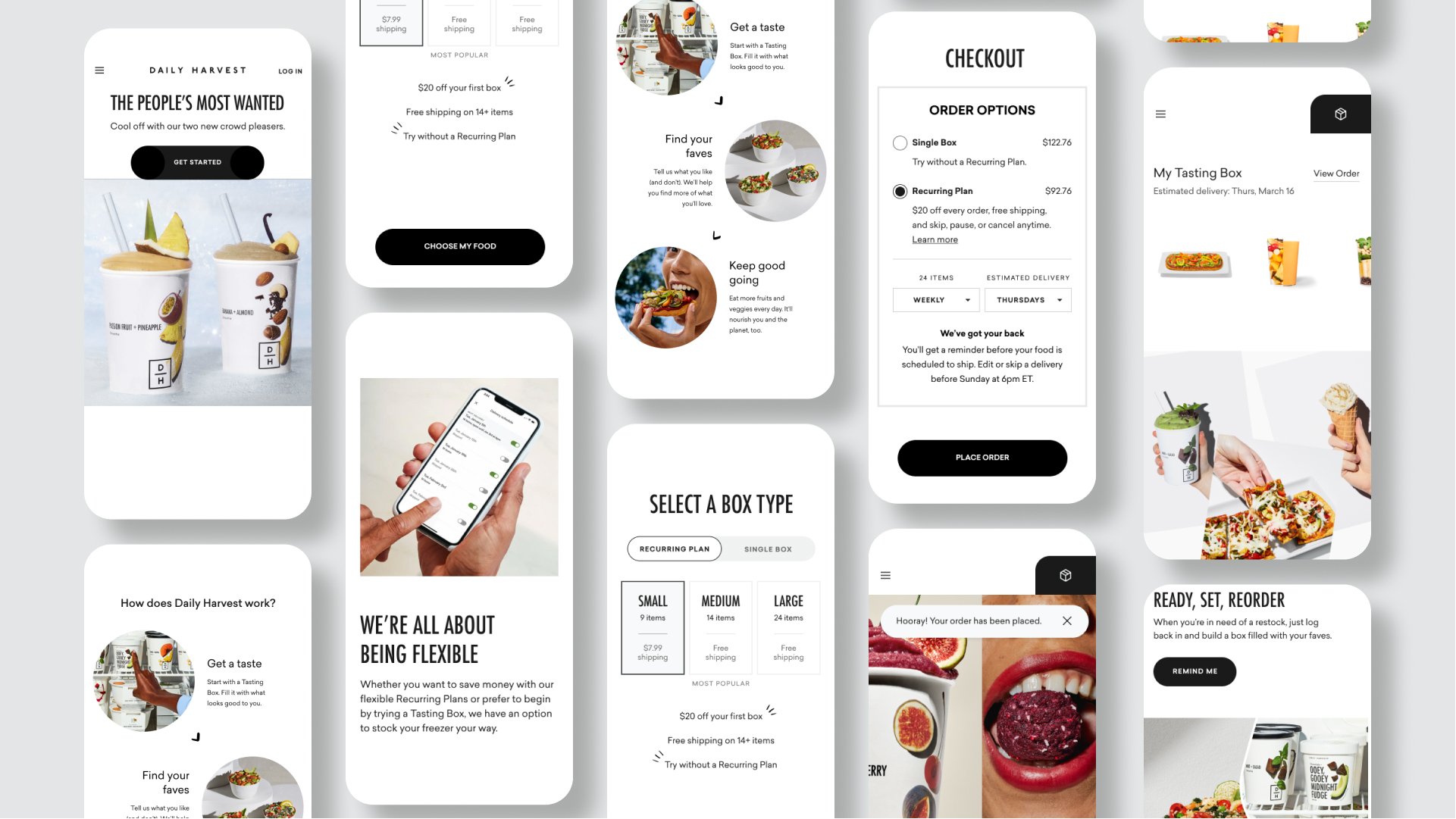
Daily Harvest - Tasting Journey
I was the lead designer on a large project at Daily Harvest as it was introducing a new business model for the first time.

Introduction
Tasting Journey was a project that aimed to give new customers the opportunity to get Daily Harvest without signing up for a subscription. This was a departure from the business model that defined Daily Harvest up to that point and carried a lot of risk with it. While we were giving customers the option to continue to get Daily Harvest without a subscription, we wanted to offer it as a Tasting Journey where by they could try it, find what they liked, and then continue. We believed that there was value in the repetition of the subscription that helped people to live better, healthier lives.

Problem Statement
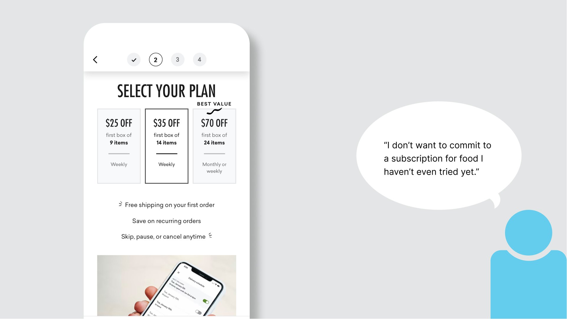
We had learned from our research with customers that many were interested in trying Daily Harvest, but were skeptical about signing up for a subscription in order to do so. We could also see from our data that a lot of people got to the very last step before bailing. This told us that we had a lot of interest, but could see reluctance in the data.

Explorations
The first round of explorations focused on offering customers a way to choose their first box as either a subscription or to order Daily Harvest as an On-Demand option.

The second exploration I did was to remove the choice between subscription and on-demand so that customers could first focus on choosing the food they wanted. This option would move that choice to checkout.

The third area I explored was to push even farther away from subscription and to see Daily Harvest as more of a store that had additional savings if you did decide to subscribe and save. With this approach I wanted to look at what our experience looked like if we removed mention of a minimum order size as well as to not gray out the checkout button. This would give us the ability to measure how many customers had an intention to checkout if they were able to with a smaller order.

Design direction - Tasting Journey
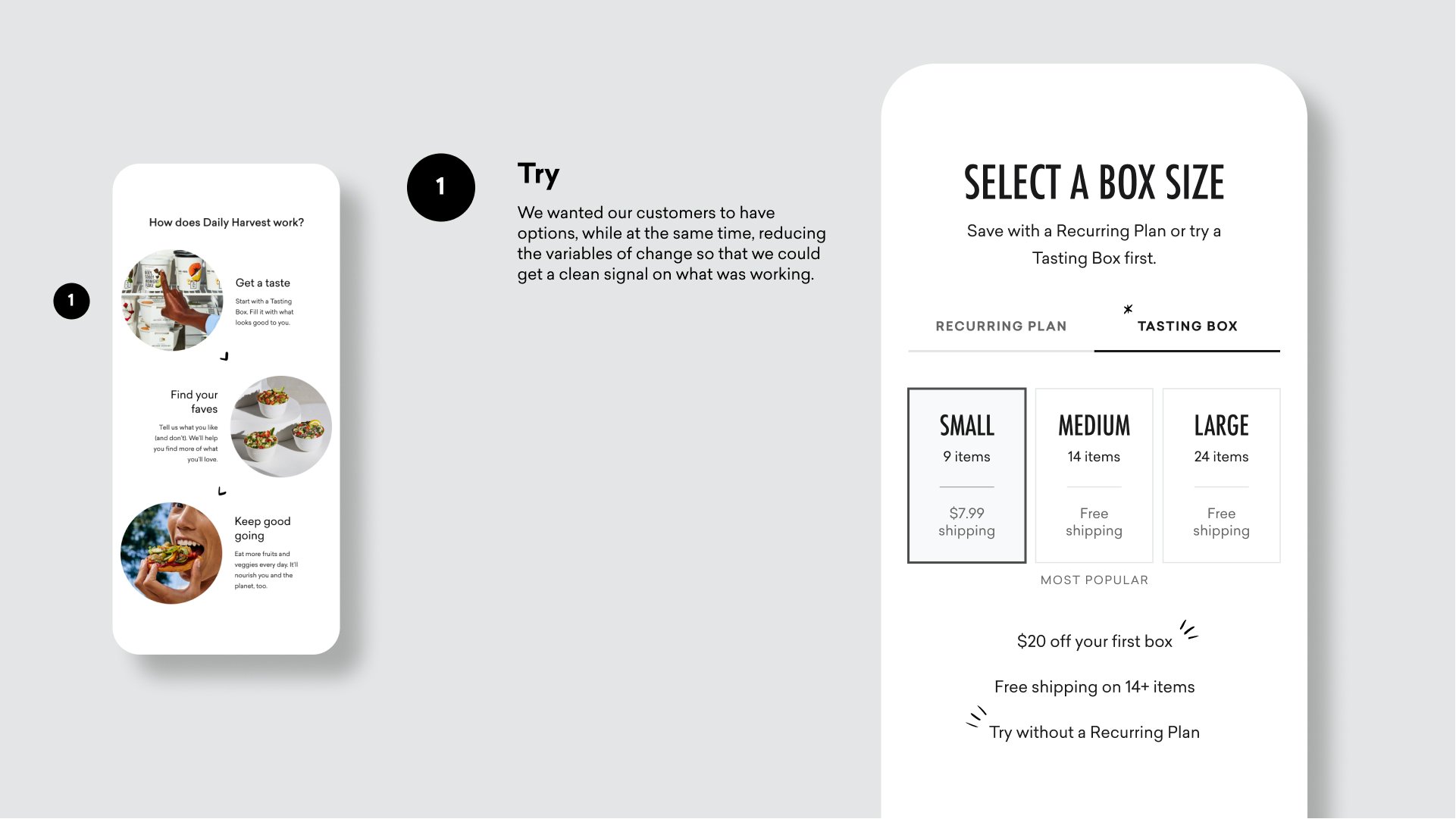
As a collaborative team we decided to focus on telling the story as a Tasting Journey in which we would guide our customers to try our food before committing to it. Wanting this to feel like an easy three step process, I came with a way of thinking of it as, Try, Love, Repeat.


Research
We did a round of user testing to be sure our approach had appeal and made sense for what customers were looking for. Most of the feedback was positive, although we heard from customers that the term “Tasting Box” wasn’t necessarily straightforward and easy to understand. We also observed that some customers seemed to miss that they could choose between a Plan and Tasting Box. They did see the option at checkout if they missed it, but we felt we were missing an opportunity present the right choices at the right time.

Refine
I made a few but worthy changes to the Plan Picker Page. I changed the title action to choose an order type rather than a box size. I also made the interaction of choosing the order type clearer with a toggle select rather than tabs, as well as changed the name of “Tasting Box” to “Single Box” for greater clarity. These additions also made the supporting copy a bit unnecessary, and by removing it, brought better focus to the interactions.

Another refinement made in this phase was to improve the post-checkout experience to make it feel more welcoming and simple experience for viewing the food you just ordered along with a confirmation of what to expect with the arrival date.

Impact
This was the first release of a huge change for a company that has built its entire business model around subscriptions. We surpassed the goals we had hoped to achieve in conversion.
